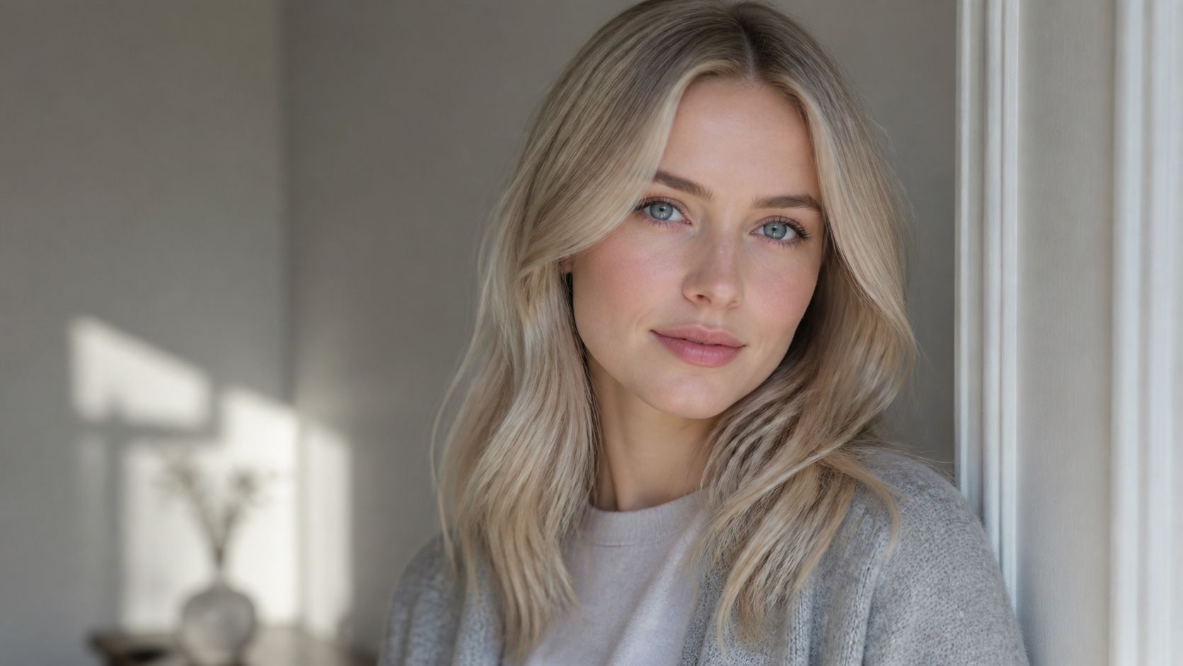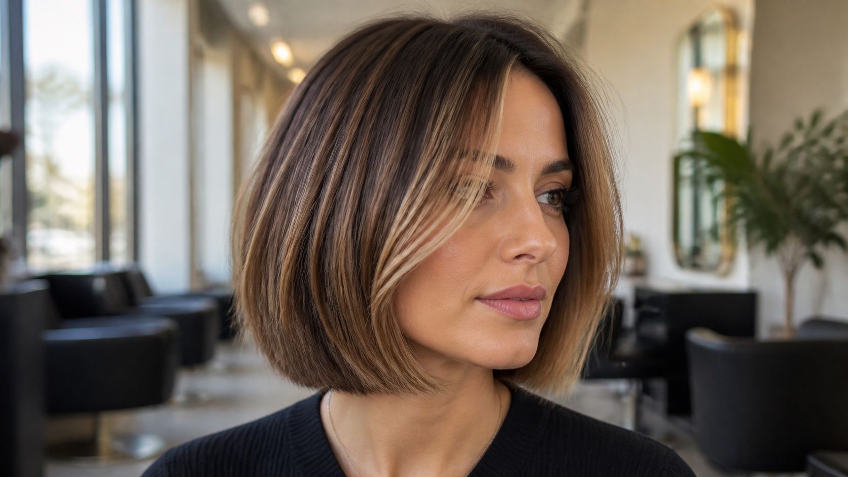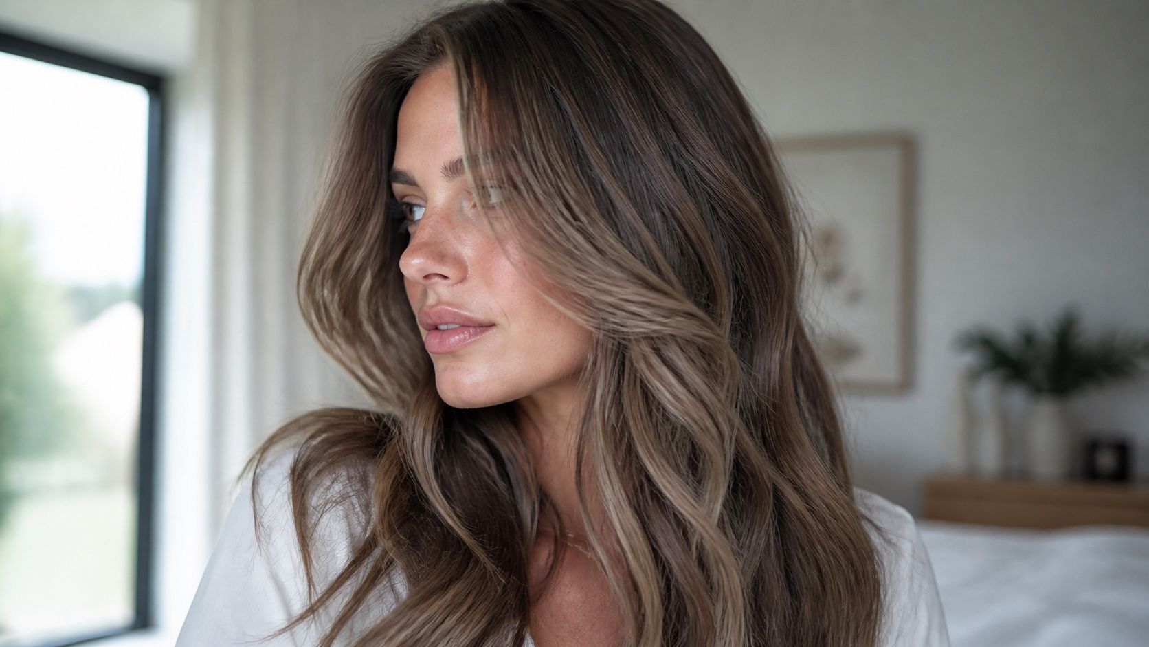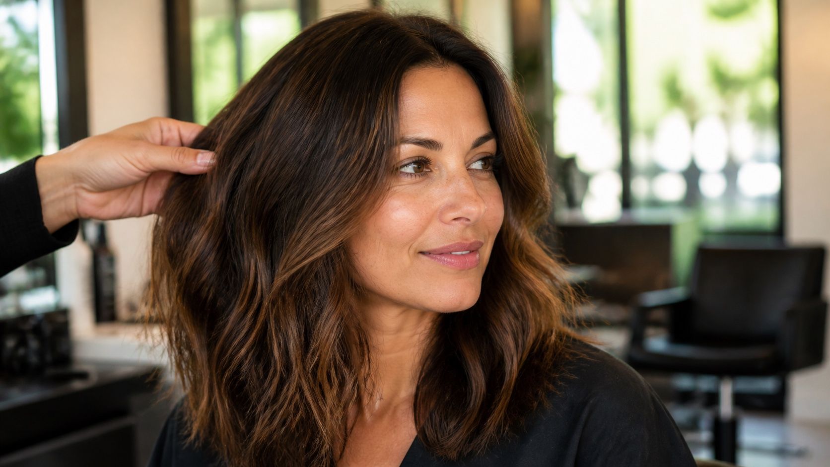
The best virtual hair colour try-on is not automatically the one with the longest shade menu or the most dramatic before-and-after. A good preview helps you make a decision you can explain later: what depth suits your face, how warm or cool the colour should be, whether the hairline looks believable, and what parts of the result still need a human colourist's judgement.
Decide what best means before opening ten previews
People search for the best virtual hair color try on for very different reasons. One person wants to see if black hair would feel too severe before booking a salon appointment. Another is choosing between honey blonde and beige blonde for a home dye. Someone else simply wants to check whether a bold copper would clash with their everyday clothes. Those are not the same task, and one preview tool may not serve all of them equally well.
Realistic edges beat a giant shade library
A huge shade library looks impressive for about five minutes. Then the practical question arrives: does the colour stay on the hair? Hair edge detection is where a try-on earns trust. Check the outline around the fringe, temples, flyaways, curls, and shoulders. If the mask cuts off soft pieces of hair or paints the wall behind you, the shade may still be fun to look at, but it is weak evidence for a real change.
Edges matter because hair colour is rarely judged in the middle of a perfect sheet of hair. It is judged at the part line, around the face, and where thin ends meet clothing. A warm brunette can look convincing through the mid-lengths while looking fake at the forehead. Platinum can appear clean on a straight section while turning messy around baby hairs. The best preview does not have to be flawless, but the errors should be small enough that you can still read the idea.
Shade names deserve the same caution. A tool may offer ash brown, mushroom brown, beige brunette, iced coffee, and soft taupe. Those labels can be helpful, but they are not universal colour formulas. Compare the visual result, not just the name. If two shades look almost identical on your photo, choose the one whose depth and warmth make more sense rather than chasing the more fashionable label.
Test dark hair, highlights, and textured hair on purpose
Dark hair is the quickest way to expose an overconfident preview. If a tool turns black hair into pastel lavender without showing any loss of depth or need for lightening, it is giving you a fantasy layer. That may be fine for mood and social images. It is not fine if you are trying to decide whether a salon change is realistic. For brunette hair, compare deeper shifts first: espresso, soft black, red-brown, chestnut, cool brown, or a subtle violet-black.
Highlighted hair needs a different test. A flat all-over overlay can erase the very thing you paid for: lighter ribbons, shadow roots, balayage, face-framing pieces. Look for whether the preview keeps some dimension or simply floods the whole head with one colour. If you have blonde ends and a darker root, a believable result should still hint at that structure unless you are deliberately testing a full correction.
Textured hair also deserves attention. Curls, coils, waves, and frizz catch light in small broken planes, not one smooth curtain. A good preview should leave texture visible. If the tool makes curls look painted over, the colour may read richer than it would in real movement. Test one photo with your hair styled as usual, not only a stretched or freshly smoothed version. The everyday photo is less glamorous, but it answers the better question.
Privacy and photo handling are part of the comparison
Hair try-on feels harmless because it is beauty, but the input is still your face. Before uploading a sharp portrait, take a minute to think about the photo itself. Crop out a work badge, a child in the background, mail on the table, or anything else you would not casually hand to a stranger. This is not paranoia. It is basic tidiness when a tool asks for a personal image.
Without naming or ranking products, I would compare the controls around the photo as closely as the colours. Is it clear what happens after upload? Can you use a cropped image? Do you understand whether the preview is stored, shared, or deleted? Some tools make this easier to understand than others. If the page is vague, use a lower-resolution crop that still shows your hair clearly, or choose a photo that does not reveal much beyond your face and hair.
There is also a practical privacy angle for salon planning. You do not need to upload five private bathroom selfies to every tool you find. Use one clean test photo, save the results that matter, and stop. The goal is a decision, not a permanent gallery of your face scattered across accounts you will forget by next month.
Build a short comparison list
Once you have two or three candidate tools or previews, compare them against the same photo. Changing both the tool and the photo makes the result almost impossible to judge. Use the same lighting, same hairstyle, and same crop. Then look for boring, useful details: edge quality, root handling, how many realistic browns or blondes are available, whether highlights survive, and whether the export is clear enough to show someone else.
| What you need | Compare this first | Bad sign | Useful decision |
|---|---|---|---|
| Salon colour planning | Hairline, roots, and natural-looking depth | The shade covers skin or ignores old colour | Save two believable directions for a colourist |
| Choosing between brunettes | Warmth, coolness, and contrast against the face | Every brown looks glossy and identical | Pick the family before worrying about the exact name |
| Testing blonde ideas | Roots, ends, and whether highlights stay visible | The preview makes dark hair pale blonde instantly | Ask what lightening or toning would be needed |
| Trying vivid colour | How the colour behaves over your actual base | Pastels look perfect on untreated dark hair | Use it as a mood reference, not a promise |
| Privacy-conscious testing | Crop options and clear photo controls | You cannot tell what happens to the image | Use a simple cropped portrait or skip the tool |
Keep the list short. A comparison with twelve tools turns into noise, especially if several use similar shade names. Two solid previews and one rejected option are usually enough for a real conversation. The rejected option matters because it shows the boundary: too orange, too flat, too close to black, too bright around the face.
Use the winner as a note, not a verdict
The strongest preview should become a note, not a final verdict. Save the original photo beside the chosen preview. Add one sentence about why it works: softer near the face, cooler than current colour, keeps depth at the root, makes the ends look intentional. That sentence will be more useful than saying I want this exact colour, because exact colour on a screen depends on lighting, display settings, and the tool's overlay.
If you are going to a salon, bring the preview with context. Mention previous permanent dye, bleach, toner, henna, grey coverage, or any section that grabs colour differently. A colourist can translate a virtual shade into a practical route: gloss first, lowlights, colour correction, gradual lightening, or a smaller face-framing change. The preview starts the conversation. It does not replace it.
If you are colouring at home, be even more conservative with what the preview promises. Read the dye instructions, check the strand-test guidance from the product, and remember that your starting colour controls the outcome. The best virtual try-on is the one that makes you more specific and less impulsive. It should help you say yes to a direction and no to a fantasy that only works because the screen was generous.