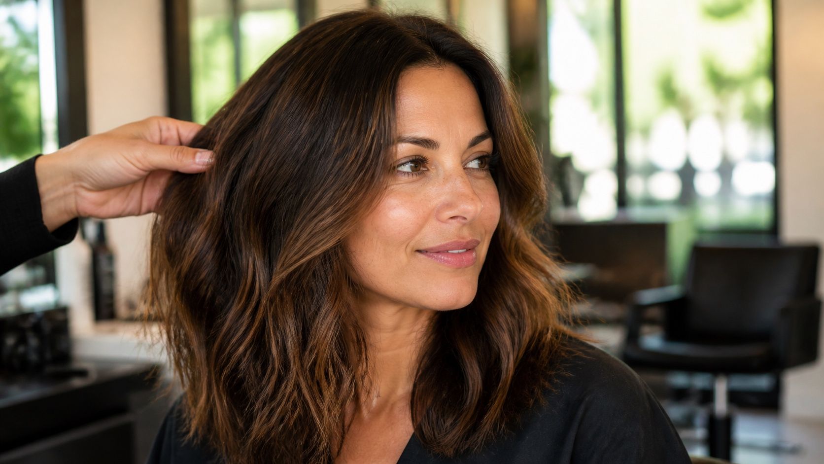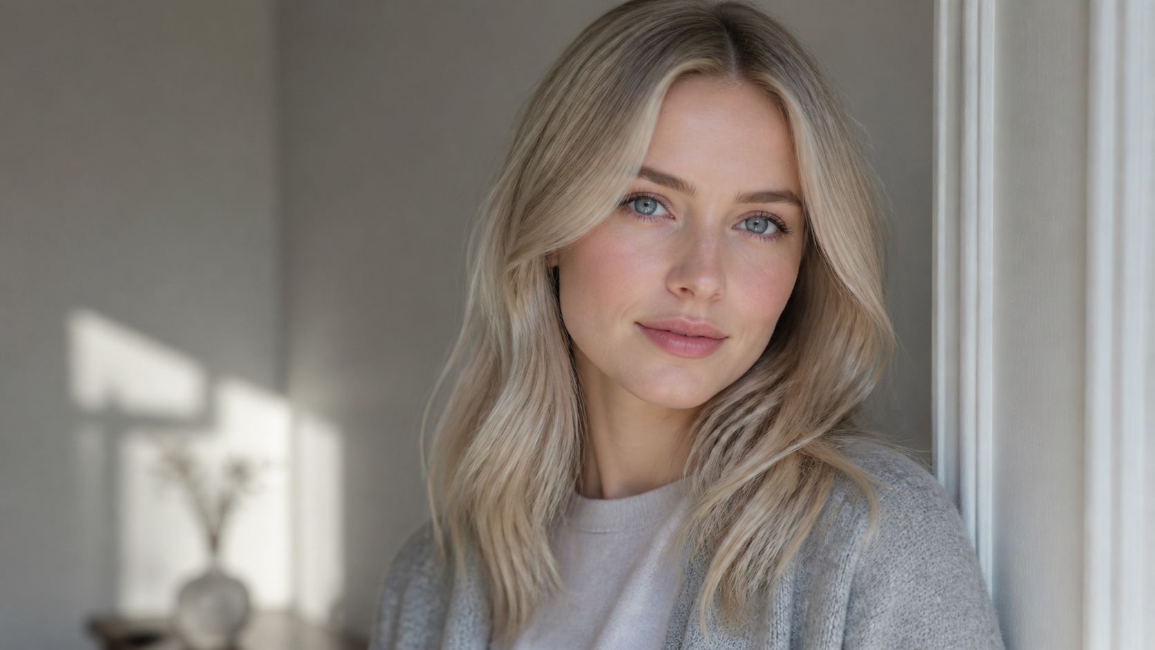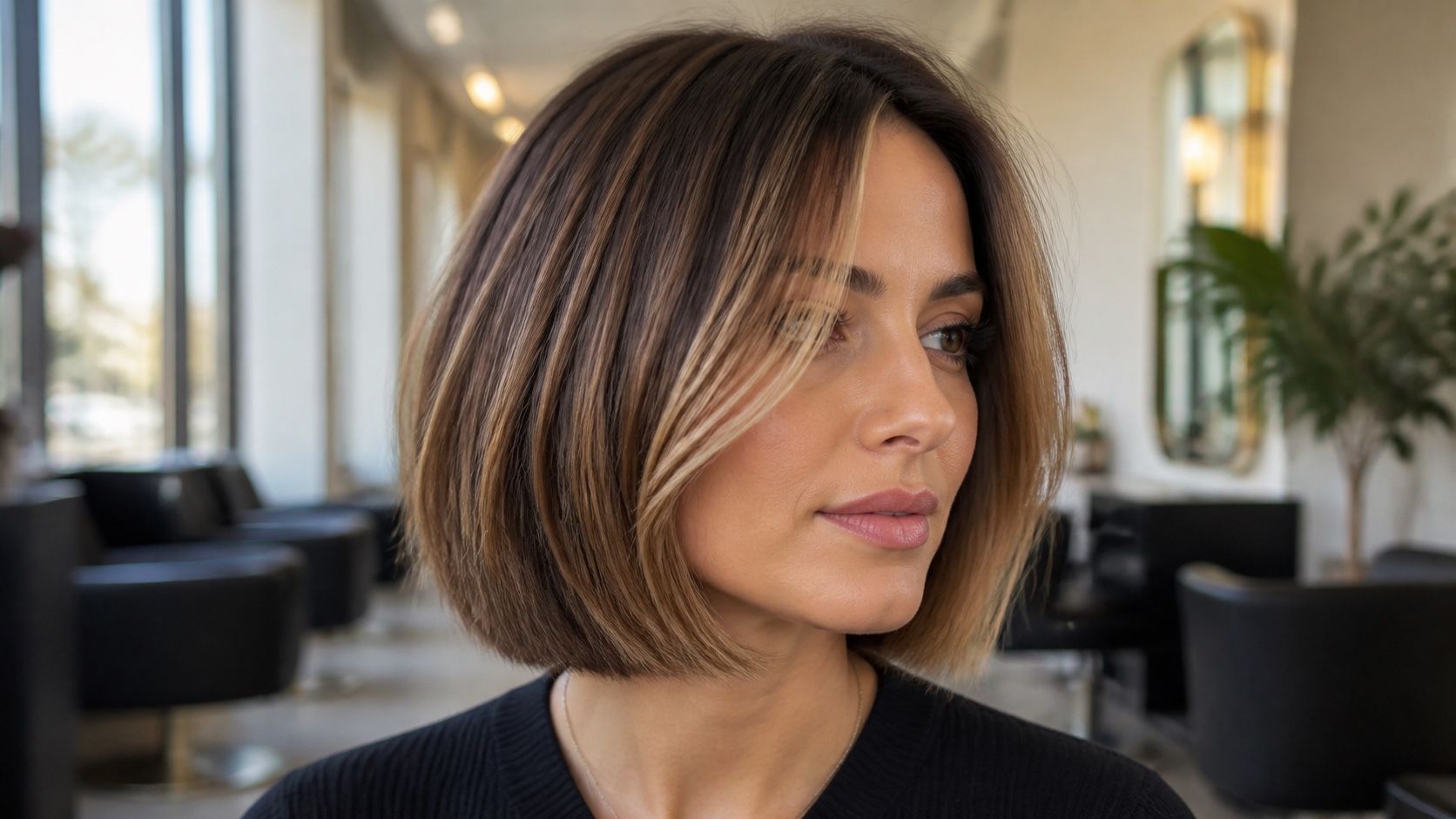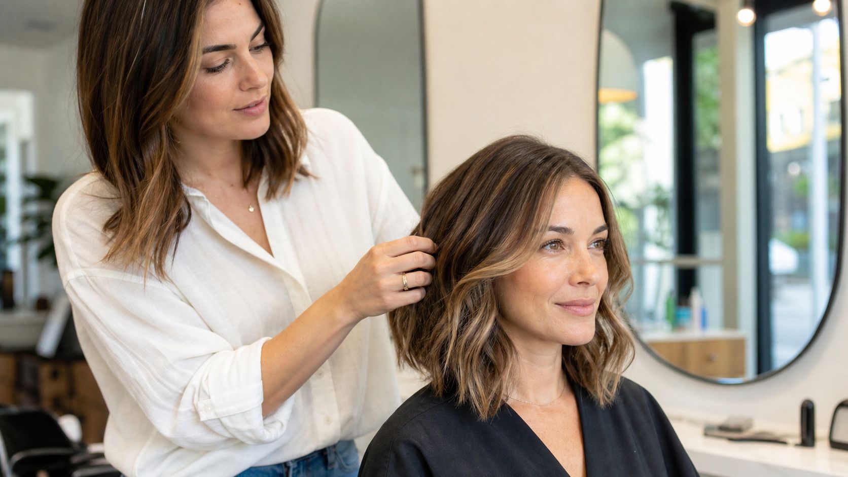
A free hair colour preview can save you from a surprisingly expensive mistake, but only if you treat it as a rough mirror, not as a dye formula. The useful question is not whether the screen looks exciting for ten seconds. It is whether the preview helps you notice what will matter in real life: depth, warmth, contrast, roots, ends, and the way the colour sits against your face.
Start with a photo that does not fight the tool
The best free preview usually starts before you open the tool. Take a fresh front-facing photo near a window, with daylight on your face and hair rather than a yellow bathroom light above your head. If the light is coming from one side, turn slightly until both sides of the hair are visible. A virtual hair color try on free tool can only work with the pixels it sees; if half your hair is a shadow, the result will look more like a guess than a preview.
Know what the preview is really guessing
A shade simulation is not the same thing as a colour appointment. The tool does not know your hair history, porosity, developer strength, old box dye, or how much warmth lives under your current shade. It is painting a probable colour over a photograph. That is still useful, but only for the right kind of decision. It can show whether copper makes your skin look warmer, whether ash brown feels too flat, or whether black hair makes your features look sharper than you expected.
Shade names can also be slippery. One tool may call a colour mocha brown, another may call almost the same preview soft espresso. Cherry cola, mushroom blonde, cinnamon brunette, icy beige, and honey blonde are visual directions, not salon recipes. I like using the preview to sort the family first: lighter or deeper, warm or cool, natural or statement. Once that is clear, the exact formula belongs with a colourist or with the dye instructions you are actually using.
Be suspicious of previews that make every shade look clean and glossy. Real hair has uneven sections. A blonde with old highlights may take a toner differently at the ends. A deep brunette may need lightening before a vivid red shows properly. A virtual try-on that makes pastel pink sit perfectly on dark hair is giving you mood-board energy, not a practical result. Enjoy it, but do not let it make the hard part invisible.
Roots, ends, and old colour need a separate look
Most disappointing previews fail at the same place: they treat the whole head as one surface. Real hair rarely behaves like that. Roots may be darker, glossier, and healthier. Ends may be porous, sun-faded, highlighted, or stained from older colour. If the tool puts the same caramel brown over both, it can look smooth on screen while hiding the exact problem your stylist will have to solve.
Zoom in on the roots first. Does the colour start cleanly at the hairline, or does it bleed onto the forehead and ears? If your natural root is visible, check whether the preview makes the grow-out look softer or more obvious. For anyone with grey around the temples, the hairline is where the fantasy often breaks. The app may blur the grey into the rest of the shade, while real colour needs a plan for coverage, blending, or leaving some silver visible on purpose.
Then look at the ends. Bleached ends can make cool colours look smoky, but they can also turn muddy. Warm ends can push beige shades orange. If you already have balayage, money pieces, or a shadow root, compare an all-over preview with a softer idea in your notes: root melt, gloss, lowlights, or face-framing colour only. The free tool may not model those details perfectly, but it can still show whether you like high contrast near your face.
Use a small comparison instead of testing every shade
The easiest way to waste an hour is to try every colour and keep none of the decisions. Pick three or four previews. One should be close to your current colour, one should be the safer change you could imagine actually booking, and one can be the bold option that made you curious in the first place. Put them next to the original photo. The original matters because your eye adjusts quickly; after fifteen previews, even a strange shade can start to look normal.
| Current hair situation | Useful preview to test | What to watch before saving it |
|---|---|---|
| Dark brunette or black | Soft espresso, cool brown, deep red-brown | Check whether the preview unrealistically lifts the hair too much in one step |
| Medium brown | Chocolate, chestnut, caramel brunette | Look for warmth around the cheeks and whether the shade feels too orange indoors |
| Blonde or highlighted | Beige blonde, honey blonde, soft copper | Compare roots and ends because old highlights can make the result uneven |
| Red or copper hair | Auburn, mahogany, muted brown | Watch whether the preview hides the warmth that will still influence real dye |
| Grey or silver blend | Soft ash, mushroom brown, pearl blonde | Check the temples and part line instead of judging only the glossy mid-lengths |
After that, stop adding more shades for a moment. Write one plain note under each saved image: makes eyes clearer, washes skin out, roots look harsh, ends look better, too dramatic for work, surprisingly calm. Those little comments are more useful than a folder of thirty screenshots with no memory attached.
Check the places where mistakes show first
Do not judge the preview only from the middle of the hair. The mistakes usually show at the hairline, around the ears, over the shoulders, and beside the cheek. If the colour smears onto skin, treat the shade with caution. It may still be a good direction, but the preview is not clean enough to decide fine details like fringe colour or face-framing highlights.
Zoom out as well as in. A colour that looks beautiful at close range can feel heavy when the whole head is visible. This is especially true with black, blue-black, burgundy, platinum, and very cool ash shades. They can sharpen the face in a good way, or they can make the haircut look like a helmet. Look at the preview as a small thumbnail, because that is close to how other people first read your hair in photos.
If you can, repeat the test with one indoor photo and one daylight photo. You do not need a full photoshoot. A quick second image near a window and another under your usual evening light will tell you whether the shade only works in flattering conditions. I trust a slightly boring daylight preview more than a dramatic filtered one. Boring is often closer to what you will see on Tuesday morning.
What to save for a salon conversation
Save the original photo, the two strongest previews, and one option you rejected for a clear reason. That rejected image can be surprisingly useful. It tells a colourist what you mean by too warm, too dark, too flat, or too much contrast. If you are colouring at home, it still helps you avoid buying the shade that looked exciting for five minutes and wrong by the next day.
Add a short note about your current hair: natural root colour, old highlights, previous permanent dye, henna if relevant, and how light the ends already are. The preview cannot carry that history. A colourist can. If the photo made you love a cool brunette but your ends are warm and porous, the conversation becomes more grounded: how close can we get, what needs correcting first, and what will maintenance look like after four weeks?
A free virtual try-on is useful when it slows the decision down. It lets you test a direction privately, notice the parts of the image that look false, and arrive with better words than I want something different. Keep the screen in its place. Let it narrow the choice, not promise the result.